Hey folks!
RtR has moved! yes. same great insight, different, and somewhat spiffier looking space.
The new Reason to Read
cheers,
Kyle
10.27.2009
10.06.2009


When traveling in Europe, Paris and London specifically, I was struck by these very large, very cool underground looking posters for Levi's. The words were ambiguous, yet intriguing. The photography: stark and raw. I liked them. Upon returning to the states, I realized that these same ads were here, all over new york city, and becoming more and more frequent every day. The posters, magazine ads, billboards, and websites are all part of the Go Forth Campaign for Levi's jeans. Now this is cool.
Levi's approached Wieden + Kennedy for these ads, with a goal of, according to executive creative director Susan Hoffman, wanting to pay homage to Levi's history, "but also to refresh and reinvent the idea of a pioneering spirit for the times in which we live". Pretty awesome. The ads also feature copy by none other than the ultimate American pioneer, Walt Witman... post-mortem credits baby!
From a design point of view, I love them. I think they're original, and full of energy. The white type over photography is simply beautiful. The words are few and chosen perfectly. This is what I try to do with my type and print work too, pick out words that are poetry to me and pick them out as art pieces themselves. Levi's has illuminated this concept for the masses.
Also, I think these ads are a PERFECT thing to have around. This last year has been tough for America, and there's also the problem that Americans don't get out enough. These ads prompt the exploration of America, and the spirit of what got us here in the first place: pioneersmanship. What an up lift!
Finally, This Go Forth Campaign has some other incredibly interesting history, apparently giving the campaign its name. True or not, it's an incredibly thrilling concept, and something to be excited about. This is the story according to Levi's:

Pretty cool. I'll be following the history over the next several weeks about Grayson Ozias IV. The official contest started yesterday. Check it out. If you're not into that kind of thing, then at least keep an eye out for the ads. They're beautiful. And really make me want to go read more Walt Witman.
10.04.2009
9.28.2009
Rocky vs. Design

What does Rocky Balboa have to do with Design? Everything.
I, being my lazy self sometimes, just finished watching the conclusion of Rocky III, the epic retribution match between dethroned Rocky and the new Heavyweight Champion of the World Clubber Lang. a.k.a. Mr T. I pity the Fool! Anyway, in watching the fight, with it's ever inspiring music, I realized that the fight was as much about design as it was about sweaty meatheads with ridiculous bodies out for vengeance.
Stick with me here.
The first round: Rocky comes out strong at the starting bell, throwing rights over and over and over again... right in Clubber's Face. The constant battle we designers have with design is one that takes patience, and strategy for the long haul three round fight. It's so easy to come out strong jousting your creative demons, design challenges, or the blank page. Clubber doesn't seem to have too much to say for himself, with all the power and ferocity that Rocky comes at him with. Rocky's got this in the bag. But, what is easy to forget when you've got the high ground early on like that is that Clubber is HUGE.
Clubber is a large, angry, mohawked man, well more than capable of knocking your teeth out of your head. In the second round, Rocky again comes out strong, barraging Clubber with another front of hits. Suddenly, the demon awakens. Clubber, smashes Rocky. Once. Twice. Consistently brutal, and Rocky is surprised. Where did this come from? Apollo Creed is suprised. "Get up man! GET! UP!" Rocky takes a beating. nose bloodied, eyes sent to the back of his skull, and cheeks cut up. Design can do that to you. The second you think you've got the leg up, bam, out of nowhere comes the worst thing you could have imagined. Nose bloodied, eyes sent to the back of the skull, and cheeks cut up. Well, you get it.
The turning point of the fight, and subsequently this analogy, leading to Rocky's (spoiler alert) victory in the third round is when Rocky's trainers realize the genius of the situation. "What is he DOING? Get up! ... wait... he's not going down, he's getting MAD." The whole time, it's a psychological game. Rocky was never getting hit by surprise. He was never down and out. He was never had. Rocky played the game. He knew what inspired him, and played Clubber's arrogance to his strength. He faked him out. Rocky always had the high ground. He went into the fight with it already won in his head. He went into the fight knowing the game better than Clubber. He went into the fight knowing that he had the strength, the knowledge, the wit, and the skills to come out successful. He knew design better than anybody. The point is that as designers, we engage in bouts everyday. Most are not for Heavyweight Champion of the World, but they're fights nonetheless. You've got to know the game better than it does. You've got to be able to have strategy, foresight, and confidence. You've got to play the game better than design itself. That's what made the Balboas, the Rands, and the H&FJs. It's always been a psychological game. That's what Rocky has to do with design.
So, go forth stallions of creativity. You are the eyes of the tigers and at the top of the steps... and computer screens.
9.25.2009
Amelia
Amelia.
Oh Amelia. I've never met her, read much on her, or looked into her life at any kind of depth. However, I cannot WAIT to see this movie coming out in October (the 23rd to be exact). Amelie, starring Hilary Swank, looks like one of those period films that is going to be at least a little more interesting than the next. I'm not here to critique movies though, (as you can probably tell from the wording of this post already) I want to bring to attention the title lettering. Amelia.
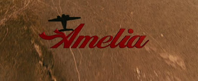
I think it's great! (again, I'm terrible a critiquing movies) the scarf A is pretty genius at giving a whimsy, airy, and fun feel to the film. It reminds me of a script version of Didot, which in itself is intriguing. But yes, because I'm a type nerd, I''m gonna go see this movie in October just because their attention to the titling. I'm really glad they didn't just go with Trajan, or Helvetica, or something else god-awful. I think more movies and films, not just of this magnitude and size, but especially of this magnitude and size, should think about having custom lettering on their movie titles. They've thought of customizing the motion graphics of opening sequences, end credits, and even how the movie trailers get audiences into theater seats, you'd THINK they would have caught on to their flagstaff first impression needing more attention: their title lettering. Thank you Amelia, thank you. Take note movie poster studios! Take note.

Oh Amelia. I've never met her, read much on her, or looked into her life at any kind of depth. However, I cannot WAIT to see this movie coming out in October (the 23rd to be exact). Amelie, starring Hilary Swank, looks like one of those period films that is going to be at least a little more interesting than the next. I'm not here to critique movies though, (as you can probably tell from the wording of this post already) I want to bring to attention the title lettering. Amelia.
I think it's great! (again, I'm terrible a critiquing movies) the scarf A is pretty genius at giving a whimsy, airy, and fun feel to the film. It reminds me of a script version of Didot, which in itself is intriguing. But yes, because I'm a type nerd, I''m gonna go see this movie in October just because their attention to the titling. I'm really glad they didn't just go with Trajan, or Helvetica, or something else god-awful. I think more movies and films, not just of this magnitude and size, but especially of this magnitude and size, should think about having custom lettering on their movie titles. They've thought of customizing the motion graphics of opening sequences, end credits, and even how the movie trailers get audiences into theater seats, you'd THINK they would have caught on to their flagstaff first impression needing more attention: their title lettering. Thank you Amelia, thank you. Take note movie poster studios! Take note.

8.14.2009
Cardon Copy


How many times have you been walking around, in the city or not, and seen some LOST DOG sign, or a HAVE YOU SEEN THIS CAT? poster jotted out in sharpie, probably disintegrating from the rain, torn, dingy, unappealing and/or illegible? They're everywhere. It's interesting enough that we have such a habit of doing this mass poster-ing of telephone poles and public message boards when we lose a pet, or decide to have a garage sale. oh, the garage sales. But i also find it interesting how for such a regular need for public communication, we as a very digitally inclined, information hungry, visually stimulated and communally dependent people haven't found any better method for announcing these circumstances other than these dirty, ugly, and ineffective 'posters'. Personally, I cannot (and will not) STAND the sight of another pink posterboard taped up to a stop sign announcing something three blocks away in too many unclear letters.
Solution: Cardon Copy. FINALLY, someone has taken up the initiative to stand up to this unprogressed area of human interaction. these are his words:
CARDON COPY, TAKES THE VERNACULAR OF SELF-
DISTRIBUTED FLIERS AND TEAR-OFFS WE HAVE ALL SEEN
IN OUR NEIGHBORHOODS. IT INVOLVES HIJACKING
THESE UNCONSIDERED FLIERS AND REDESIGNING THEM,
OVER POWERING THEIR MESSAGE WITH A NEW VISUAL
LANGUAGE. I THEN REPLACE THE ORIGINAL WITH THE
REDESIGN IN ITS AUTHENTIC ENVIRONMENT.
Genius. I appreciate this kind of self initiated design, and it's not like it's detrimental or grafitti, or anything bad because it's actually HELPING the people who's posters he's taking down. I think they're fantastic, and hope to see more. Cardon Webb lives in Queens, and his design portfolio isn't too shabby either, check it out.
7.13.2009
PROFILE: Abi Huynh
This week's profile is one of the up and coming professionals in the type world. Abi Huynh is a graphic designer originally from Lethbridge, Alberta, Canada, and currently living in the Netherlands attending the Koninklijke Academie van Beeldende Kunsten (Den Haag) in the Type and Media Masters program. (um, dream school.) Abi's been featured on many blogs already but I believe the work is especially important for designers who are just leaving school, or will be very soon. As is the work of many of the designers currently at the Koninklijke Academie, it's modern, contemporary, and new. We're always on the quest for the next new thing, but these students' all have the contextural drive as well.
Here are some examples for Huynh's new text face: Arietta. Abi Huynh says "it is intended for short subject and non-fiction books, the family consists of a transitional roman with multiple text italics that provide modulating degrees of stylistic contrast from the roman. Arietta Book has a serious, unobtrusive and reserved tone while the three italic companions each produce a distinct character and textural density."
Also, this stuff is just cool, and the sample book is incredible. It's worth a look through the entire portfolio as well, namely the collaborative work for Johnathan Frere-Jones, another personal icon. Inspiring stuff.


Here's Abi's website: check it out!
7.11.2009
moleskine sketches Fall 2008


As some of you may know, residing in my left back pocket, is my constant companion, my moleskine. Sometimes it's a boredom solver, sometimes, an agenda, but always, a tool. A tool I use to get out my love for poetry, honesty, and type design. yeah yeah, everyone's got a moleskine, but I think the stuff I put in there is an honest reflection of possible ideas. These are a collection of moleskine sketches from the fall season of 2008. Enjoy!
Subscribe to:
Posts (Atom)